T-Mobile is known for it's Magenta shops and young and trendy commercials. They have alot of young people working at their stores but not alot of people apply for a job via their current website. Our goal was to improve this.
Case Study Overview
Challenge: Not alot of people are applying via the T-Mobile website
Goal: Help improve the website to get more people to apply
My role: Research, UX, UI
Tools: Interview session, Analytics tools, Adobe XD
Duration: 2 months
Here we go.

Discover
Interviews
For this challenge I used interviews as the main research method, because it’s all about the candidates and why they apply or don't apply. Also I wanted to be able to ask WHY or other follow up questions, have an in-depth understanding of the audience’s values, perceptions, and experience while gaining insights.
I chose to conduct semi-structured interviews in order to have a free-flowing conversations and open athmosphere. I don't want it to feel very corporate. I showed different websites with different lay outs, different media and different visuals and asked which they were attracted to and why. I also asked questions to understand how they scanned the websites and if the websites were user friendly enough.
My audience is made out of people works at T-Mobile, doesn't work at T-Mobile and used to work at T-Mobile.
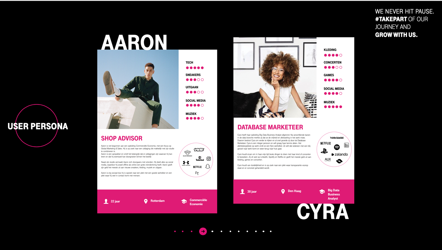
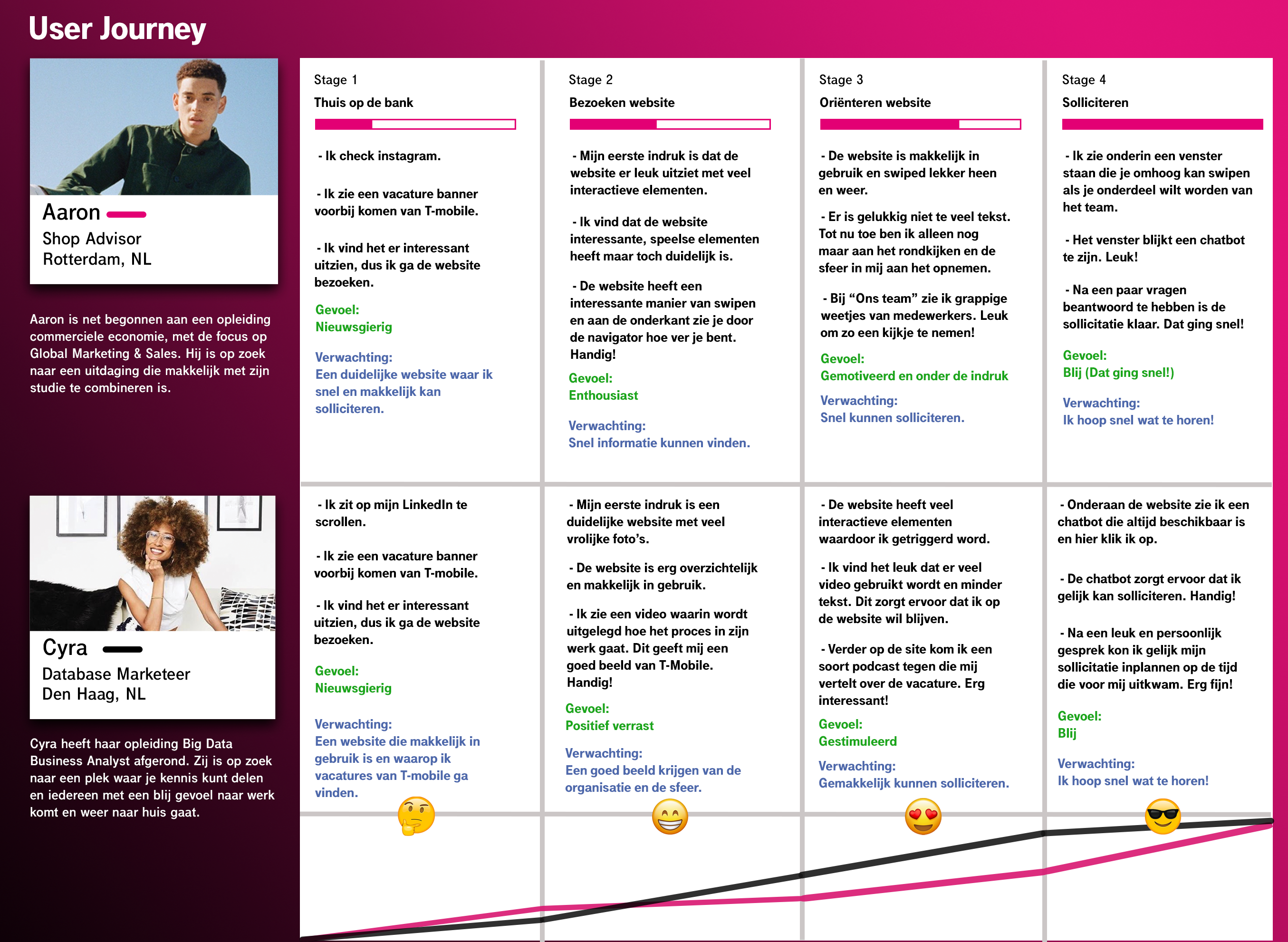
Persona
I created a persona to better illustrate the main people I’d find solutions for. I define his/her needs and expectations and use this as a guide and to help me move on to the ideation phase. They define expectations, concerns, motivations, and are really helpful when it comes to designing a product that will satisfy user needs.
Define the problem
Analyses
I use this phase to fully understand the goal of my design project, to articulate the design problem and will later turn them into chances. These chances will set the tone for the flow chart and wireframe.
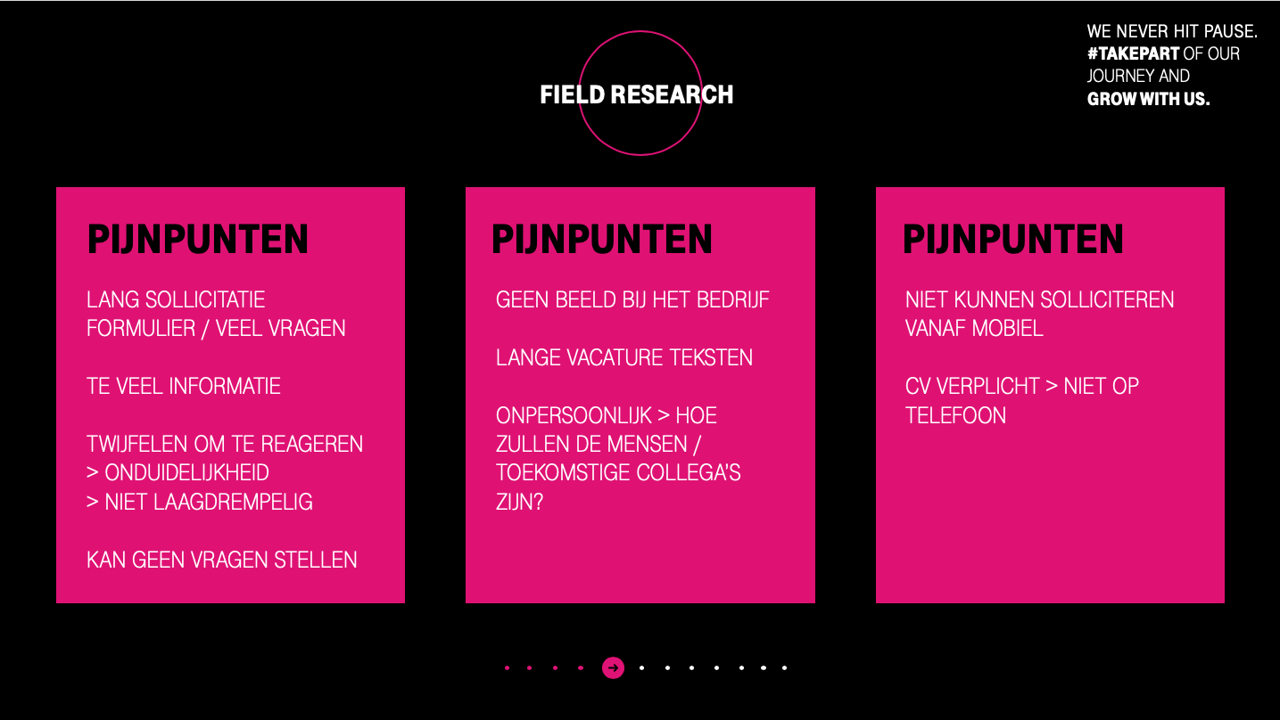
Key findings
- Most people don't get a clear sense of how the working atmosphere is at T-Mobile and don't feel connected to T-Mobile as an organisation because the website is pretty corporate and there aren't alot of people (photo's, quotes etc) on the website.
- Texts are too long especially texts on job pages.
- Texts on the website aren't scan-able.
- There is too much (corporate) information which isn't necessary in the beginning of the orienting phase.
- It's not easy to connect with a recruiter to ask questions. It feels formal to connect because the only way to connect is through a question form.
- It's not super easy to apply via phone. The website is a desktop first design and it is obligated to apply with a resume. This is a missed chance since more then 80% (checked with our Data Analyst) of traffic visits the T-Mobile website with their phone and not everyone has their resume on their phone or is able to adjust their resume on their phone. Some people will stop applying and will apply "later" on their desktop. Only 20% of the people I interviewed actually applies later on their desktop.
- Website feels a bit corporate and it feels more as a product website then a people's website.
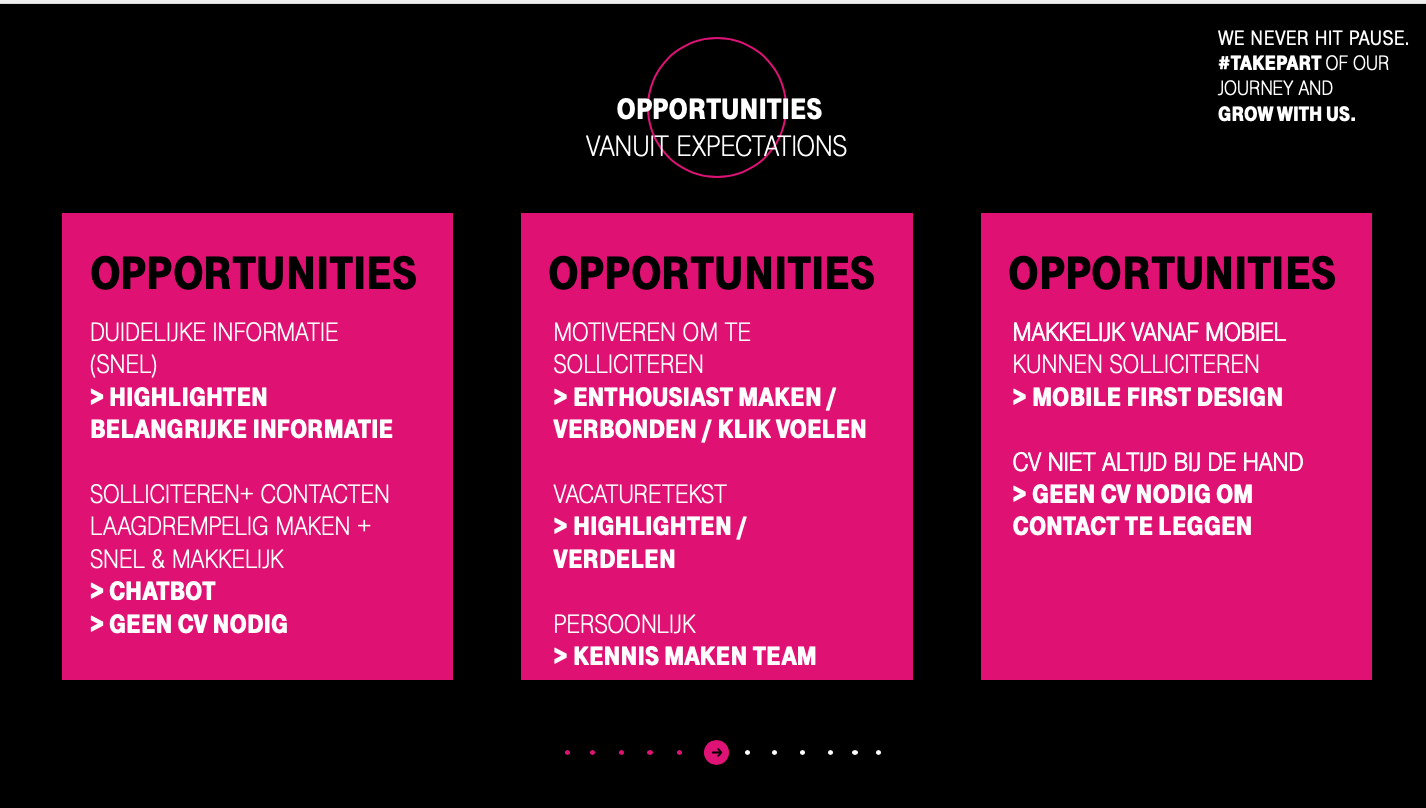
Ideate
I use this phase to turn problems into opportunities. These opportinities stands for the expectations from our Persona and are the base of the website.
Sketch
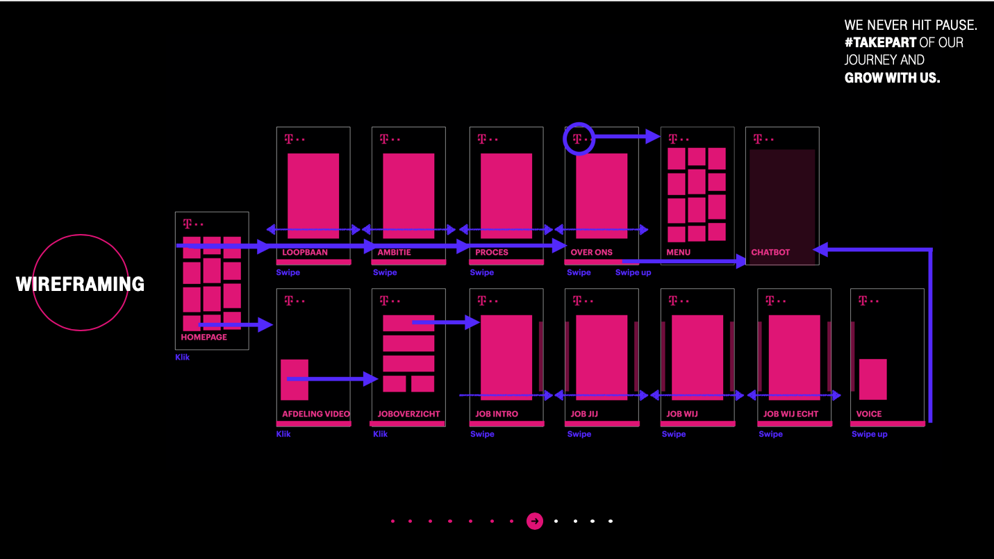
Flow Website
I built a user flow and Wireframe to figure out how the pages flow/interact together and how the user journey will look like.
Test
Goal of this phase is to find out if the website is giving the right experience, is easy to use and meets the expectations. I ask people to give their opinion about what they see if they think it's easy to use and will give them tasks to do so I can find out if the website is user friendly.
I used Adobe XD to test the screens on mobile with 3 of the people I interviewed at the beginning of the project. The interviews were one on one sessions.
Key findings:
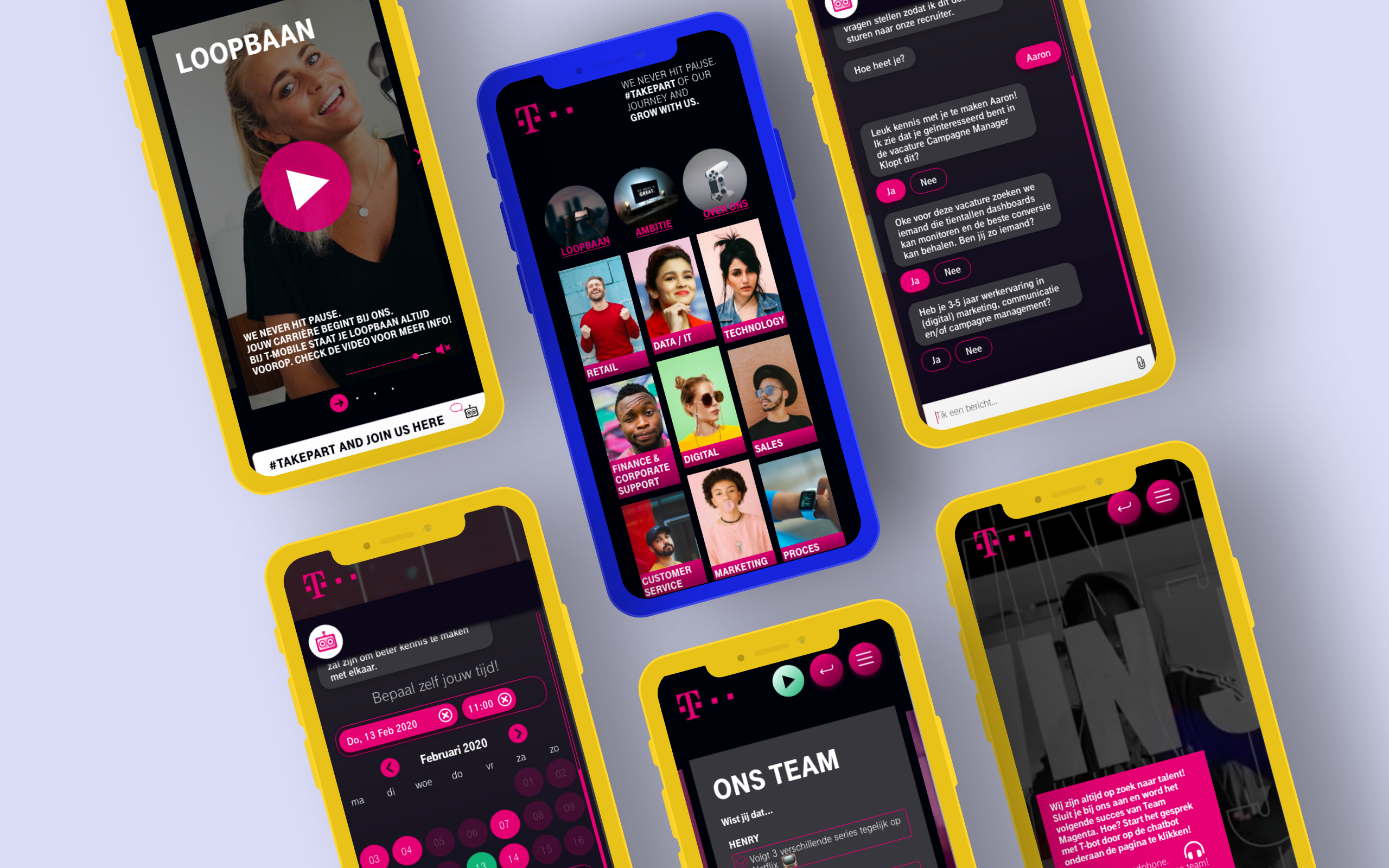
- They loved the look and feel. It doesn't feel like a typical job website but you know it's a job website right from the start.
- They liked the fact that it's a mobile first design and your able to apply without your resume.
- They liked the swiping interactions.
- They loved the videos on the background.
- They loved the team content (Facts about colleagues, Spotify playlist, landingpage with video per Discipline)
- They loved the chatbot.
- They loved that there isn't alot of text and the scan-able level.
- They really liked that you are able to listen to the job page. I designed this so you can read/listen job descriptions 24/7. Even when you're in your car.
- Some people weren't able to find the chatbot because they thought the button didn't really feel as a button so I redesigned this
Prototype
Based on the findings from the testing, I started finishing and adjusting the design and created a prototype.
Next steps:
- I will set up a few usability sessions to determine if people are encountering problems / if there are things to improve.
- We will measure the website with tracking pixels to get insights on how long people are staying on certain pages, if people are using the play button, if people are listening to the Spotify playlists, if people are playing the videos and for how long, how often the chatbot is used, how high the apply rate is and to see which page is the exit page